3 Climatic niches in space and time
3.1 Utilization distributions
For each month, we compute the density of GPS locations using a kernel estimator (kernelUD in adehabitatHR):
monthKerAll <- hab::kernelUD(monthLocsAll["month"], grid = as(rast, "SpatialPixels"))
monthKerAllSp <- estUDm2spixdf(monthKerAll)
We illustrate it with the example of the temperatures in January:
ggplot() + geom_raster(data = rastDF, aes_string(x = "x", y = "y", fill = names(rastDF)[4])) +
    geom_sf(data = states, fill = NA, size = 0.2, colour = gray(0.2)) + geom_point(data = data.frame(wost),
    aes(x = x, y = y), shape = 20, size = 0.8, stroke = 0, colour = "gray") +
    geom_point(data = data.frame(monthLocs[[1]]), aes(x = x, y = y), shape = 20,
        size = 0.3) + geom_contour(data = data.frame(monthKerAll[[1]]), aes(x = Var2,
    y = Var1, z = ud), colour = "black") + coord_sf(xlim = c(-92, -77.5), ylim = c(24.5,
    35), expand = FALSE) + scale_fill_viridis(end = 0.8, alpha = 1, option = "plasma") +
    labs(x = "Latitude", y = "Longitude") + theme(legend.position = "none")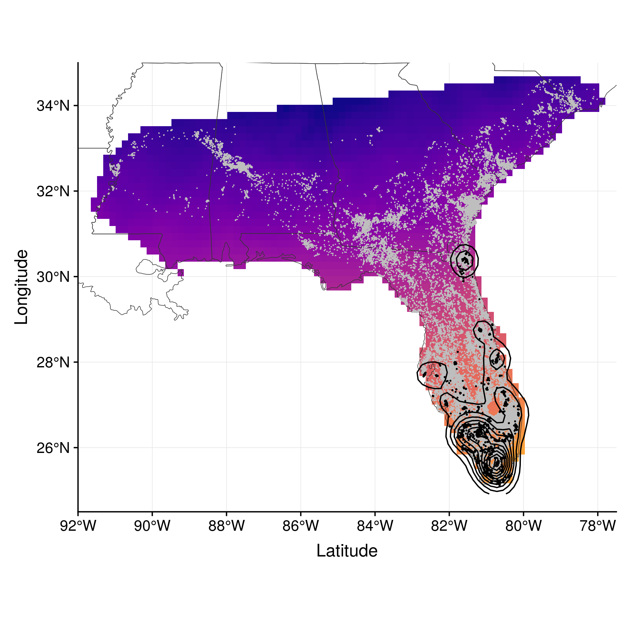
Figure 3.1: Range estimation in January using kernel density estimator.
Finally, we can quantify spatial overlap over time by estimating kernel overlap. To do this, we use the Bhattacharyya’s affinity (BA), a synthetic measure (i.e. symmetric), which is more appropriate to quantify the overall similarity of two UDs (see Fieberg and Kochanny (2005) for more details).
class(monthKerAll)## [1] "estUDm"overGeo <- hab::kerneloverlap(monthKerAll, method = "BA")
round(overGeo, 2)## 1 2 3 4 5 6 7 8 9 10 11 12
## 1 1.00 0.97 0.91 0.72 0.71 0.60 0.51 0.51 0.53 0.68 0.87 0.96
## 2 0.97 1.00 0.94 0.76 0.74 0.64 0.54 0.54 0.55 0.69 0.87 0.95
## 3 0.91 0.94 0.99 0.89 0.87 0.79 0.68 0.68 0.69 0.83 0.92 0.93
## 4 0.72 0.76 0.89 0.99 0.99 0.95 0.86 0.85 0.84 0.91 0.86 0.79
## 5 0.71 0.74 0.87 0.99 0.99 0.96 0.87 0.85 0.84 0.90 0.84 0.78
## 6 0.60 0.64 0.79 0.95 0.96 1.00 0.95 0.93 0.92 0.93 0.79 0.68
## 7 0.51 0.54 0.68 0.86 0.87 0.95 1.00 0.98 0.97 0.90 0.71 0.59
## 8 0.51 0.54 0.68 0.85 0.85 0.93 0.98 1.00 0.98 0.91 0.71 0.60
## 9 0.53 0.55 0.69 0.84 0.84 0.92 0.97 0.98 1.00 0.94 0.74 0.63
## 10 0.68 0.69 0.83 0.91 0.90 0.93 0.90 0.91 0.94 1.00 0.89 0.78
## 11 0.87 0.87 0.92 0.86 0.84 0.79 0.71 0.71 0.74 0.89 1.00 0.94
## 12 0.96 0.95 0.93 0.79 0.78 0.68 0.59 0.60 0.63 0.78 0.94 0.99
## attr(,"method")
## [1] "BA"
## attr(,"class")
## [1] "kerneloverlap"par(mar = c(4.5, 4.5, 0, 0) + 0.1)
image(x = 1:12, y = 1:12, overGeo, asp = 1, col = viridis(100, direction = -1,
option = "plasma", alpha = 0.8), axes = FALSE, xlab = "", ylab = "", cex.lab = 1.5)
axis(1, at = 1:12, labels = month.abb, tick = FALSE, line = -0.7)
axis(2, at = 1:12, labels = month.abb, tick = FALSE, line = -0.7)
mtext("Month", side = 1, line = 2, cex = 1.5)
mtext("Month", side = 2, line = 1.7, cex = 1.5)
mtext("A) Geographic overlap", side = 3, line = 0.6, cex = 1.5)
lab <- expand.grid(x = 1:12, y = 1:12)
lab$val <- as.vector(round(overGeo * 100, 0))
text(lab$x, lab$y, lab$val, cex = 1 + (lab$val - 50)/100, col = ifelse(lab$val >=
80, "white", "black"))
polygon(x = c(rep(0:12 + 0.5, each = 2), rep(11:1 + 0.5, each = 2), 0.5), y = c(1,
rep(0:11 + 0.5, each = 2), rep(12:1 + 0.5, each = 2)), col = grey(0.7),
border = NA)
abline(h = c(3.5, 10.5), v = c(3.5, 10.5), lwd = 4)
lines(x = c(0, 2, 2) + 0.5, y = c(2, 2, 0) + 0.5, lwd = 4, lty = "11")
lines(x = c(0, 2, 2) + 0.5, y = c(10, 10, 12) + 0.5, lwd = 4, lty = "11")
polygon(x = c(5, 9, 9, 5) + 0.5, y = c(5, 5, 9, 9) + 0.5, lwd = 4, lty = "11")
lines(x = c(10, 10, 12) + 0.5, y = c(12, 10, 10) + 0.5, lwd = 4, lty = "11")
lines(x = c(10, 10, 12) + 0.5, y = c(0, 2, 2) + 0.5, lwd = 4, lty = "11")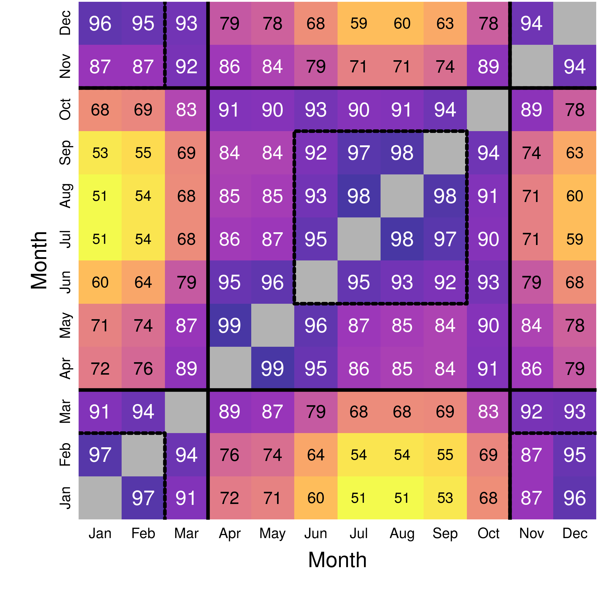
Figure 3.2: Matrix of spatial overlap month-by-month.
The map of the overlap reveals mostly two periods with heavy overlap (> 80%), i.e. similar monthly distributions in the landscape:
- Winter, from November to March;
- Summer, from April to October, with June-September being over 90% overlap.
3.2 Monthly climatic niches
Finally, we consider the monhtly climatic niches in the ecological space. For this, we need the yearly conditions, i.e. the rasters for the 12 months combined, as a reference frame:
clim <- values(rast)
clim <- na.omit(data.frame(prec = c(clim[, 1], clim[, 3], clim[, 5], clim[,
    7], clim[, 9], clim[, 11], clim[, 13], clim[, 15], clim[, 17], clim[, 19],
    clim[, 21], clim[, 23]), temp = c(clim[, 2], clim[, 4], clim[, 6], clim[,
    8], clim[, 10], clim[, 12], clim[, 14], clim[, 16], clim[, 18], clim[, 20],
    clim[, 22], clim[, 24]), month = rep(1:12, each = dim(rast)[1] * dim(rast)[2])))
dim(clim)
## [1] 22872 3table(clim$month)##
## 1 2 3 4 5 6 7 8 9 10 11 12
## 1906 1906 1906 1906 1906 1906 1906 1906 1906 1906 1906 1906cor(clim$prec, clim$temp)## [1] 0.1826839Note that, over Florida and the 12 months, the correlation between precipitation and temperature is fairly low.
climMean <- data.frame(do.call(rbind, by(clim[, 1:2], clim$month, colMeans,
    na.rm = TRUE)))
locsMean <- data.frame(do.call(rbind, lapply(monthLocs, function(x) colMeans(x@data[,
    c("prec", "temp")], na.rm = TRUE))))
(climNiches <- locsMean - climMean)
## prec temp
## 1 -56.736596 8.0292936
## 2 -50.801219 6.8600189
## 3 -51.298637 4.7433414
## 4 -30.517845 2.3709531
## 5 8.318321 1.6036885
## 6 31.980398 0.6339109
## 7 13.674096 0.3553282
## 8 24.309066 0.4430989
## 9 27.424084 1.1019436
## 10 7.227975 3.1850390
## 11 -27.819595 5.4216113
## 12 -58.646488 6.9947208We use once again January as an example for the climatic niches. In this representation, light gray points represent the overall (yearly) conditions in Florida; dark grey points are the climatic conditions of the month of interest (here January), and black points are the conditions actually experienced by wood stork (i.e. at the GPS locations). The arrows connects the mean conditions of the month to the mean used conditions.
library("ggrepel")
ggplot(clim, aes(x = prec, y = temp)) + geom_point(size = 0.1, colour = gray(0.9)) +
    geom_point(data = subset(clim, month == 1), pch = 15, colour = gray(0.7),
        size = 4) + geom_point(data = data.frame(monthLocs[[1]]), pch = 20) +
    geom_segment(aes(x = climMean$prec[1], xend = locsMean$prec[1], y = climMean$temp[1],
        yend = locsMean$temp[1]), arrow = arrow(), lineend = "round", size = 4.5,
        arrow.fill = "white") + geom_segment(aes(x = climMean$prec[1], xend = locsMean$prec[1],
    y = climMean$temp[1], yend = locsMean$temp[1]), arrow = arrow(), lineend = "round",
    size = 2, colour = "white") + geom_label_repel(data = data.frame(x = c(climMean$prec[1],
    locsMean$prec[1]), y = c(climMean$temp[1], locsMean$temp[1]), label = c("A",
    "U")), aes(x = x, y = y, label = label), fill = c(gray(0.7), "black"), colour = c("black",
    "white"), size = 10, fontface = "bold", force = 10, segment.color = NA) +
    annotate("text", x = 185, y = 18, hjust = 0, vjust = 0, size = 10, label = month.name[1]) +
    labs(x = "Precipitation (mm)", y = expression(`Temperature `(degree ~ C)))
## Warning: Removed 35 rows containing missing values (geom_point).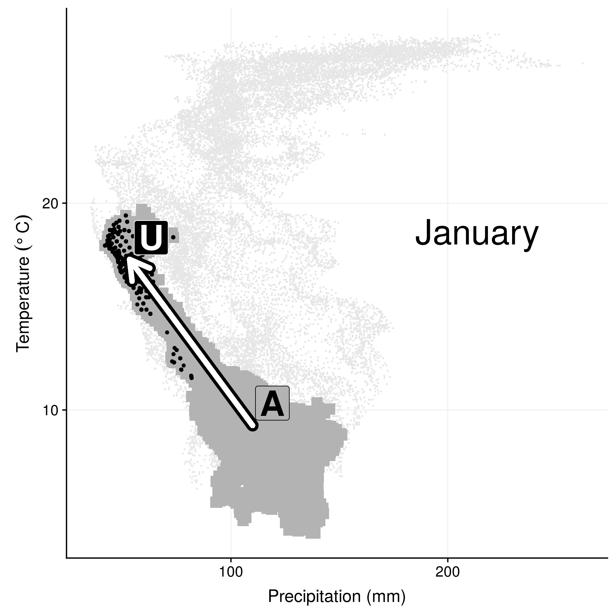
Figure 3.3: Climatic niche in environmental space in January.
Now similarly to the geographic space, we can use data in a 2D-environmental space to compute kernel overlap. In this case, we use (standardized) temperature and precipitation values as the two coordinate axes to define monthly use (with month being the only column of a SpatialPointsDataFrame):
colNA(monthLocsAll@data[, c("month", "prec", "temp")])## month prec temp
## 0 376 375monthNiche <- with(na.omit(monthLocsAll@data[, c("month", "prec", "temp")]),
SpatialPointsDataFrame(data.frame(precN = (prec - min(prec))/(max(prec) -
min(prec)), tempN = (temp - min(temp))/(max(temp) - min(temp))), data.frame(month)))
summary(monthNiche)## Object of class SpatialPointsDataFrame
## Coordinates:
## min max
## precN 0 1
## tempN 0 1
## Is projected: NA
## proj4string : [NA]
## Number of points: 59624
## Data attributes:
## month
## Min. : 1.000
## 1st Qu.: 3.000
## Median : 6.000
## Mean : 6.484
## 3rd Qu.: 9.000
## Max. :12.000plot(monthNiche, col = factor(monthNiche$month))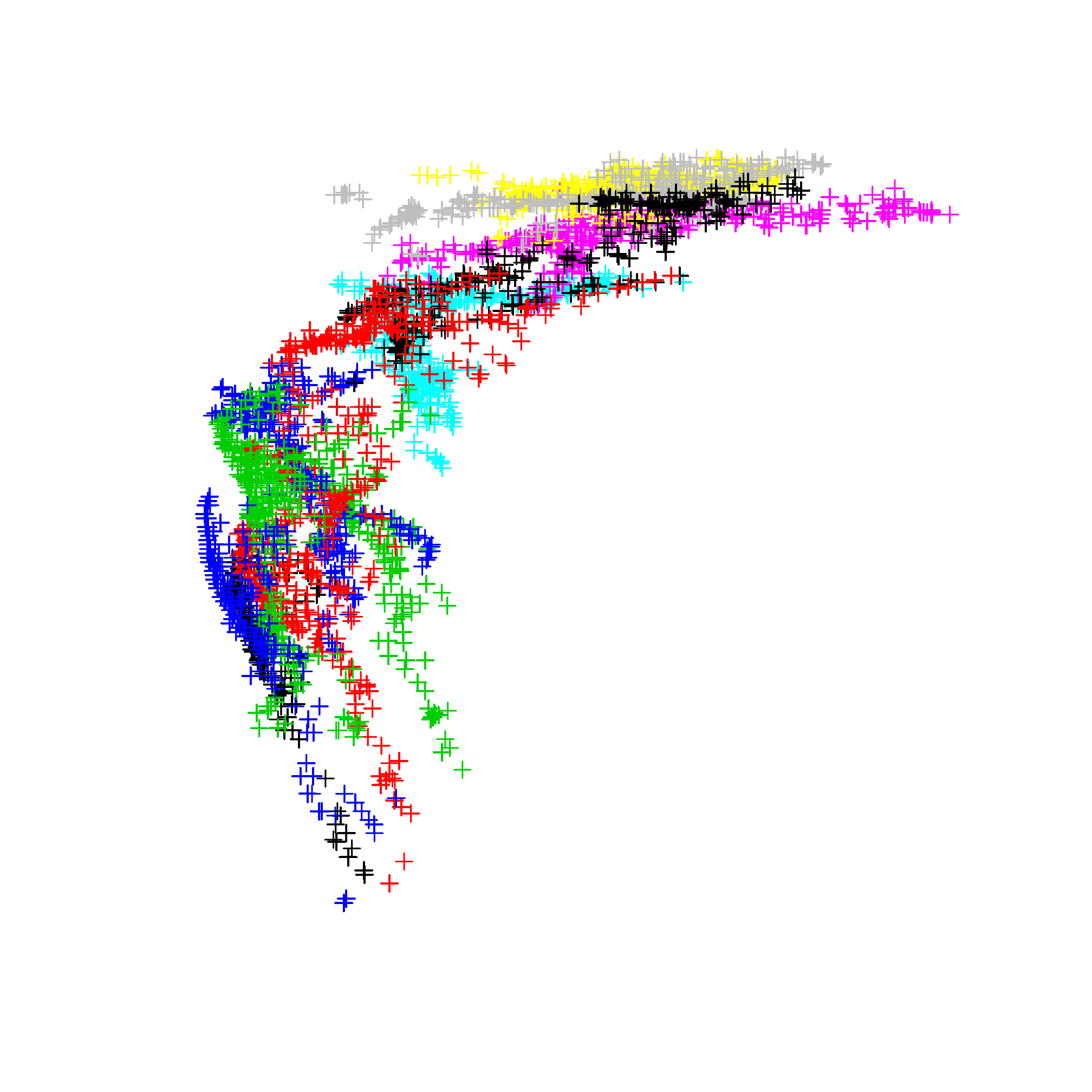
Figure 3.4: Representation of the monthly climatic niches as a coordinates in a 2D-space (precipitation and temperature).
The overlap can then be computed and plotted just like before:
overClim <- hab::kerneloverlap(monthNiche, method = "BA")
round(overClim, 2)
## 1 2 3 4 5 6 7 8 9 10 11 12
## 1 1.00 0.68 0.02 0.10 0.00 0.00 0.00 0.00 0.00 0.12 0.39 0.71
## 2 0.68 1.00 0.08 0.20 0.00 0.00 0.00 0.00 0.00 0.19 0.37 0.54
## 3 0.02 0.08 1.00 0.47 0.01 0.00 0.00 0.00 0.01 0.45 0.49 0.05
## 4 0.10 0.20 0.47 1.00 0.06 0.00 0.00 0.00 0.08 0.53 0.45 0.06
## 5 0.00 0.00 0.01 0.06 1.00 0.27 0.01 0.06 0.60 0.51 0.06 0.00
## 6 0.00 0.00 0.00 0.00 0.27 1.00 0.49 0.60 0.69 0.15 0.00 0.00
## 7 0.00 0.00 0.00 0.00 0.01 0.49 1.00 0.83 0.49 0.01 0.00 0.00
## 8 0.00 0.00 0.00 0.00 0.06 0.60 0.83 1.00 0.58 0.05 0.00 0.00
## 9 0.00 0.00 0.01 0.08 0.60 0.69 0.49 0.58 1.00 0.47 0.02 0.00
## 10 0.12 0.19 0.45 0.53 0.51 0.15 0.01 0.05 0.47 1.00 0.33 0.09
## 11 0.39 0.37 0.49 0.45 0.06 0.00 0.00 0.00 0.02 0.33 1.00 0.36
## 12 0.71 0.54 0.05 0.06 0.00 0.00 0.00 0.00 0.00 0.09 0.36 1.00
## attr(,"method")
## [1] "BA"
## attr(,"class")
## [1] "kerneloverlap"par(mar = c(4.5, 4.5, 0, 0) + 0.1)
image(x = 1:12, y = 1:12, overClim, asp = 1, col = viridis(100, direction = -1,
option = "plasma", alpha = 0.8), axes = FALSE, xlab = "", ylab = "", cex.lab = 1.5)
axis(1, at = 1:12, labels = month.abb, tick = FALSE, line = -0.7)
axis(2, at = 1:12, labels = month.abb, tick = FALSE, line = -0.7)
mtext("Month", side = 1, line = 2, cex = 1.5)
mtext("Month", side = 2, line = 1.7, cex = 1.5)
mtext("B) Climatic overlap", side = 3, line = 0.6, cex = 1.5)
lab <- expand.grid(x = 1:12, y = 1:12)
lab$val <- as.vector(round(overClim * 100, 0))
text(lab$x, lab$y, lab$val, cex = 1 + (lab$val - 50)/100, col = ifelse(lab$val >=
90, "white", "black"))
polygon(x = c(rep(0:12 + 0.5, each = 2), rep(11:1 + 0.5, each = 2), 0.5), y = c(1,
rep(0:11 + 0.5, each = 2), rep(12:1 + 0.5, each = 2)), col = grey(0.7),
border = NA)
lines(x = c(0, 2, 2) + 0.5, y = c(2, 2, 0) + 0.5, lwd = 4)
lines(x = c(0, 2, 2) + 0.5, y = c(10, 10, 12) + 0.5, lwd = 4)
polygon(x = c(5, 9, 9, 5) + 0.5, y = c(5, 5, 9, 9) + 0.5, lwd = 4)
lines(x = c(10, 10, 12) + 0.5, y = c(12, 10, 10) + 0.5, lwd = 4)
lines(x = c(10, 10, 12) + 0.5, y = c(0, 2, 2) + 0.5, lwd = 4)
abline(h = c(3.5, 10.5), v = c(3.5, 10.5), lwd = 3, lty = "11")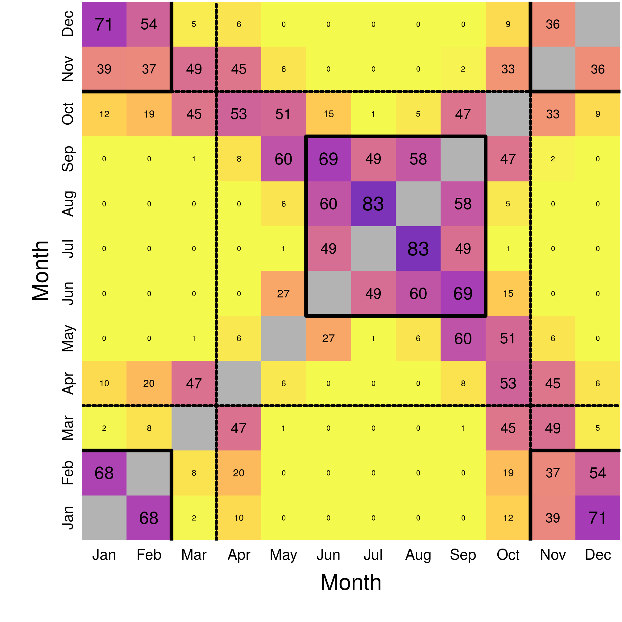
Figure 3.5: Matrix of climatic overlap month-by-month.
We can see that the overlap is a lot lower in the climatic space than in the geographic space. The map of the overlap reveals mostly two periods with marked overlap (generally > 30%), i.e. similar monthly niches:
- Winter, from November to February;
- Summer, from June to September (summer being fairly consistent with overlaps > 45%);
Another way to look at it is to consider only monthly selections, by centering everything on the monthly available conditions. In the left panel, we can see the three groups (winter in blue, summer in red, intermediate migratory in purple). In the right panel, we can see the evolution in selection through time.
mar <- data.frame(prec = climNiches$prec, prec_end = climNiches$prec[c(2:12,
    1)], temp_end = climNiches$temp[c(2:12, 1)], temp = climNiches$temp, month = c("January",
    "February", "March", "April", "May", "June", "July", "August", "September",
    "October", "November", "December"), abbr = c("Jan", "Feb", "Mar", "Apr",
    "May", "Jun", "Jul", "Aug", "Sep", "Oct", "Nov", "Dec"), nr = 1:12, season = c(rep(2,
    4), 1, rep(3, 4), 1, 2, 2))
ggplot(data = mar, aes(x = prec, y = temp, colour = season, fill = season)) +
    geom_vline(xintercept = 0) + geom_hline(yintercept = 0) + geom_segment(aes(x = 0,
    y = 0, xend = prec, yend = temp), arrow = arrow(), lineend = "round", size = 2) +
    geom_label_repel(aes(label = abbr), size = 6, fontface = "bold", colour = "white") +
    scale_color_viridis(end = 0.8, direction = -1, option = "plasma") + scale_fill_viridis(end = 0.8,
    direction = -1, option = "plasma") + xlim(-63, 40) + ylim(0, 8.2) + labs(x = "Precipitation difference (mm)",
    y = expression(`Temperature difference `(degree ~ C))) + theme(legend.position = "none")
ggplot(data = mar, aes(x = prec, y = temp, xend = prec_end, yend = temp_end,
    colour = season, fill = season)) + geom_vline(xintercept = 0) + geom_hline(yintercept = 0) +
    geom_segment(arrow = arrow(), lineend = "round", size = 2) + geom_label_repel(aes(label = nr),
    size = 6, fontface = "bold", colour = "white") + scale_color_viridis(end = 0.8,
    direction = -1, option = "plasma") + scale_fill_viridis(end = 0.8, direction = -1,
    option = "plasma") + xlim(-63, 40) + ylim(0, 8.2) + labs(x = "Precipitation difference (mm)",
    y = expression(`Temperature difference `(degree ~ C))) + theme(legend.position = "none")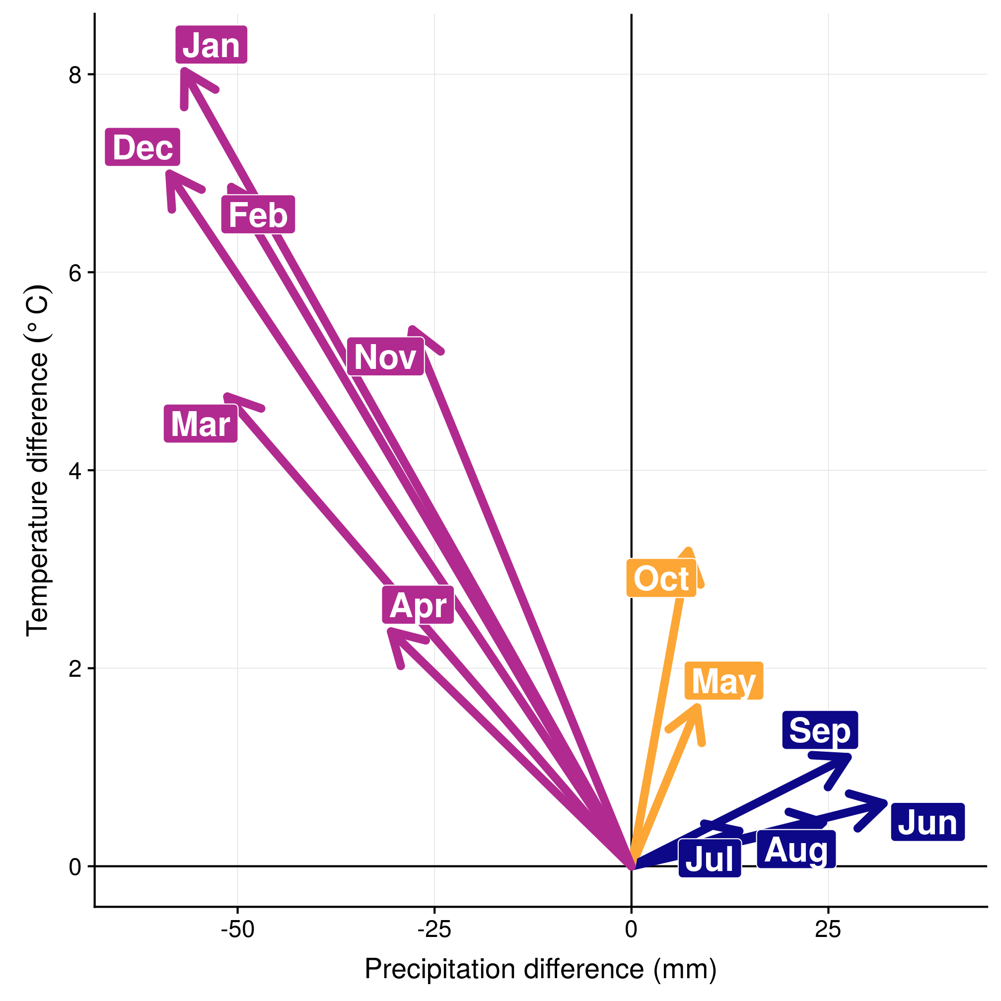
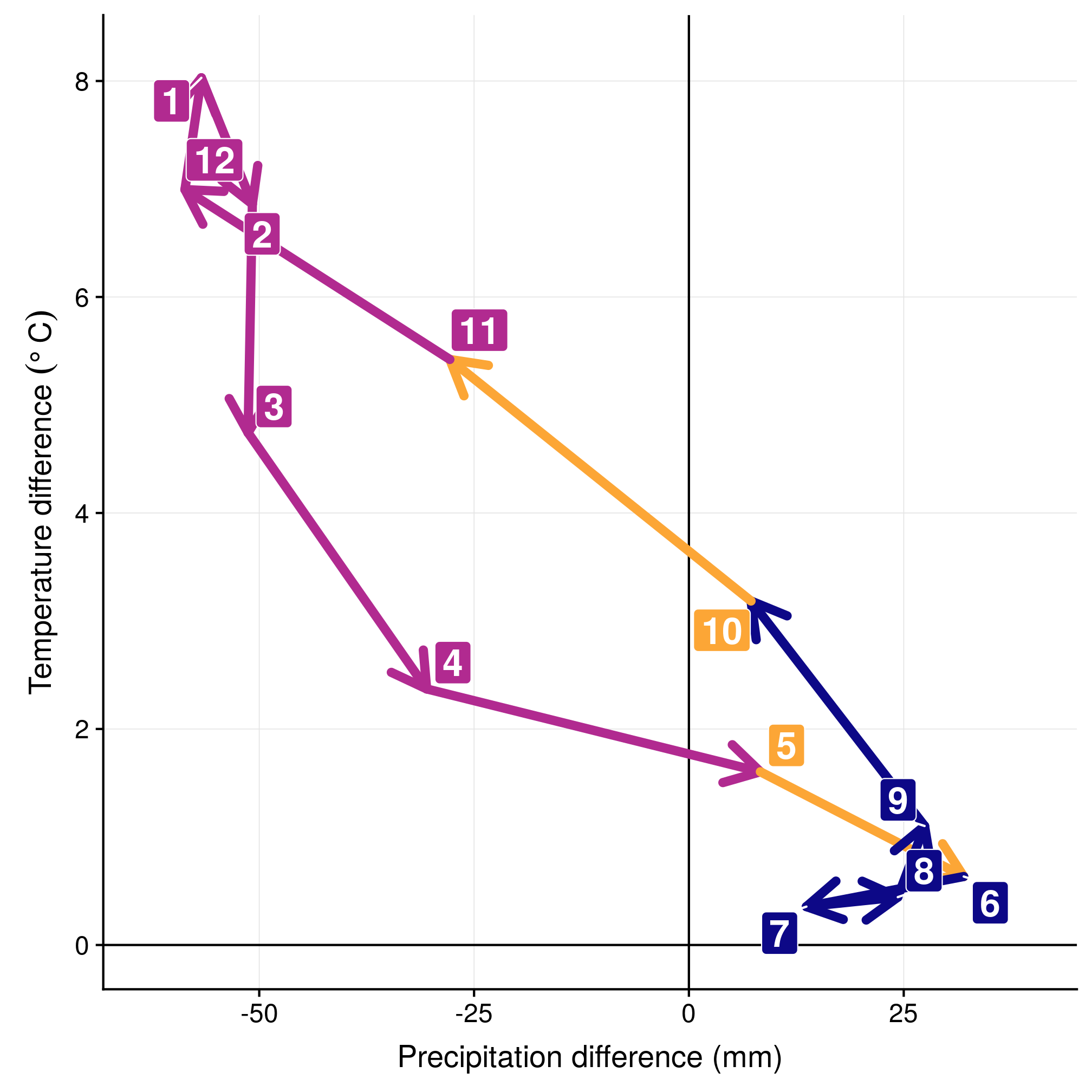
Figure 3.6: Monthly selection in the climatic space (left) and the yearly cycle (right).
References
Fieberg, John, and Christopher O. Kochanny. 2005. “Quantifying Home-Range Overlap: The Importance of the Utilization Distribution.” Journal of Wildlife Management 69 (4): 1346–59. doi:10.2193/0022-541X(2005)69[1346:QHOTIO]2.0.CO;2.