4 Manuscript figures
This page provides the exact script for the manuscript’s figures.
4.1 Fig.1: Monthly ranges and climatic niches
temp.range <- range(as.vector(rast[[(1:12)*2]]), na.rm = TRUE)
prec.range <- range(as.vector(rast[[(1:12)*2-1]]), na.rm = TRUE)

## Get legends
g1t <- ggplot() +
    geom_raster(data = rastDF, aes_string(x = "x", y = "y",
        fill = names(rastDF)[4])) +
    scale_fill_viridis(end = .8, alpha = 1, option = "plasma",
        limits = temp.range, breaks = (1:8)*5) +
    labs(x = "Latitude", y = "Longitude", fill =
        expression("Temperature " ( degree~C))) +
    theme(legend.position = "top", legend.justification = "center") +
    guides(fill = guide_colourbar(barwidth = 15, barheight = 1,
        title.theme = element_text(size = 26)))
temp_legend <- cowplot::get_legend(g1t)
g1p <- ggplot() +
    geom_raster(data = rastDF, aes_string(x = "x", y = "y",
        fill = names(rastDF)[3])) +
    scale_fill_viridis(alpha = 1, direction = -1, option = "cividis",
        limits = prec.range, breaks = (1:8)*50) +
    labs(x = "Latitude", y = "Longitude", fill = "Precipitation (mm)") +
    theme(legend.position = "top", legend.justification = "center") +
    guides(fill = guide_colourbar(barwidth = 14, barheight = 1,
        title.theme = element_text(size = 26)))
prec_legend <- cowplot::get_legend(g1p)

## Loop over all months:
for(i in 1:12){
    plot_list <- list()
    plot_list[[1]] <-
        ggplot() +
        geom_raster(data = rastDF, aes_string(x = "x", y = "y",
            fill = names(rastDF)[i*2+2])) +
        geom_sf(data = states, fill = NA, size = .2, colour = gray(.2)) +
        geom_point(data = data.frame(wost), aes(x = x, y = y),
            shape = 20, size = .8, stroke = 0, colour = "gray") +
        geom_point(data = data.frame(monthLocs[[i]]), aes(x = x, y = y),
            shape = 20, size = .3) +
        geom_contour(data = data.frame(monthKerAll[[i]]),
            aes(x = Var2, y = Var1, z = ud), colour = "black") +
        coord_sf(xlim = c(-92, -77.5), ylim = c(24.5, 35),
            expand = FALSE) +
        scale_fill_viridis(end = .8, alpha = 1, option = "plasma",
            limits = temp.range, breaks = (1:8)*5) +
        labs(x = "Latitude", y = "Longitude",
            fill = expression("Temperature " ( degree~C))) +
        theme(legend.position = "none")
    plot_list[[2]] <-
        ggplot() +
        geom_raster(data = rastDF, aes_string(x = "x", y = "y",
            fill = names(rastDF)[i*2+1])) +
        geom_sf(data = states, fill = NA, size = .2, colour = gray(.2)) +
        geom_point(data = data.frame(wost), aes(x = x, y = y),
            shape = 20, size = .8, stroke = 0, colour = "gray") +
        geom_point(data = data.frame(monthLocs[[i]]), aes(x = x, y = y),
            shape = 20, size = .3) +
        geom_contour(data = data.frame(monthKerAll[[i]]),
            aes(x = Var2, y = Var1, z = ud), colour = "black") +
        coord_sf(xlim = c(-92, -77.5), ylim = c(24.5, 35),
            expand = FALSE) +
        scale_fill_viridis(alpha = 1, direction = -1, option = "cividis",
            limits = prec.range, breaks = (1:8)*50) +
        labs(x = "Latitude", y = "Longitude") +
        theme(legend.position = "none")
    plot_list[[3]] <-
        ggplot(clim, aes(x = prec, y = temp)) +
        geom_point(colour = NA) +
        geom_point(data = subset(clim, month == i), pch = 15,
            colour = gray(.7), size = 4) +
        geom_point(data = data.frame(monthLocs[[i]]), pch = 20) +
        geom_segment(aes(x = climMean$prec[i], xend = locsMean$prec[i],
            y = climMean$temp[i], yend = locsMean$temp[i]), arrow = arrow(),
            lineend = "round", size = 4.5, arrow.fill = "white") +
        geom_segment(aes(x = climMean$prec[i], xend = locsMean$prec[i],
            y = climMean$temp[i], yend = locsMean$temp[i]), arrow = arrow(),
            lineend = "round", size = 2, colour = "white") +
        annotate("text", x = 185, y = 18, hjust = 0, vjust = 0,
            size = 10, label = month.name[i]) +
        labs(x = "Precipitation (mm)",
            y = expression("Temperature " ( degree~C)))
    assign(paste0("niche", i),
        plot_grid(temp_legend, prec_legend, NULL, plot_list[[1]],
        plot_list[[2]], plot_list[[3]], rel_heights = c(.15, 1),
        rel_widths = c(1.2, 1.2, 1), nrow = 2, ncol = 3))
    ## cowplot::ggsave(paste0("Figures/niche-", i, ".png"),
    ##     width = 7*3.4, height = 8.05)
    ## cowplot::ggsave(paste0("Figures/niche-", i, "-web.png"),
    ##     width = 7*3.4, height = 8.05, dpi = 75)
    assign(paste0("g", i, "t"), plot_list[[1]])
    assign(paste0("g", i, "p"), plot_list[[2]])
}

## Figure with January-May-August-October
g1nAU <- ggplot(clim, aes(x = prec, y = temp)) +
    geom_point(colour = NA) +
    geom_point(data = subset(clim, month == 1), pch = 15,
        colour = gray(.7), size = 4) +
    geom_point(data = data.frame(monthLocs[[1]]), pch = 20) +
    geom_segment(aes(x = climMean$prec[1], xend = locsMean$prec[1],
        y = climMean$temp[1], yend = locsMean$temp[1]), arrow = arrow(),
        lineend = "round", size = 4.5, arrow.fill = "white") +
    geom_segment(aes(x = climMean$prec[1], xend = locsMean$prec[1],
        y = climMean$temp[1], yend = locsMean$temp[1]), arrow = arrow(),
        lineend = "round", size = 2, colour = "white") +
    geom_label(data = data.frame(x = c(climMean$prec[1] - 15, locsMean$prec[1] + 25),
        y = c(climMean$temp[1] - 1, locsMean$temp[1] + .7), label = c("A", "U")),
        aes(x = x, y = y, label = label), fill = c(gray(.9), "black"),
        colour = c("black", "white"), size = 12, fontface = "bold") +
    annotate("text", x = 185, y = 18, hjust = 0, vjust = 0, size = 10,
        label = month.name[1]) +
    labs(x = "Precipitation (mm)",
        y = expression("Temperature " ( degree~C)))
g5nAU <- ggplot(clim, aes(x = prec, y = temp)) +
    geom_point(colour = NA) +
    geom_point(data = subset(clim, month == 5), pch = 15,
        colour = gray(.7), size = 4) +
    geom_point(data = data.frame(monthLocs[[5]]), pch = 20) +
    geom_segment(aes(x = climMean$prec[5], xend = locsMean$prec[5],
        y = climMean$temp[5], yend = locsMean$temp[5]), arrow = arrow(),
        lineend = "round", size = 4.5, arrow.fill = "white") +
    geom_segment(aes(x = climMean$prec[5], xend = locsMean$prec[5],
        y = climMean$temp[5], yend = locsMean$temp[5]), arrow = arrow(),
        lineend = "round", size = 2, colour = "white") +
    geom_label(data = data.frame(x = c(climMean$prec[5], locsMean$prec[5] + 5),
        y = c(climMean$temp[5] - 2, locsMean$temp[5] + 2), label = c("A", "U")),
        aes(x = x, y = y, label = label), fill = c(gray(.9), "black"),
        colour = c("black", "white"), size = 12, fontface = "bold") +
    annotate("text", x = 185, y = 18, hjust = 0, vjust = 0, size = 10,
        label = month.name[5]) +
    labs(x = "Precipitation (mm)",
        y = expression("Temperature " ( degree~C)))
g8nAU <- ggplot(clim, aes(x = prec, y = temp)) +
    geom_point(colour = NA) +
    geom_point(data = subset(clim, month == 8), pch = 15,
        colour = gray(.7), size = 4) +
    geom_point(data = data.frame(monthLocs[[8]]), pch = 20) +
    geom_segment(aes(x = climMean$prec[8], xend = locsMean$prec[8],
        y = climMean$temp[8], yend = locsMean$temp[8]), arrow = arrow(),
        lineend = "round", size = 4.5, arrow.fill = "white") +
    geom_segment(aes(x = climMean$prec[8], xend = locsMean$prec[8],
        y = climMean$temp[8], yend = locsMean$temp[8]), arrow = arrow(),
        lineend = "round", size = 2, colour = "white") +
    geom_label(data = data.frame(x = c(climMean$prec[8] - 5, locsMean$prec[8] + 5),
        y = c(climMean$temp[8] - 2, locsMean$temp[8] - 2), label = c("A", "U")),
        aes(x = x, y = y, label = label), fill = c(gray(.9), "black"),
        colour = c("black", "white"), size = 12, fontface = "bold") +
    annotate("text", x = 185, y = 18, hjust = 0, vjust = 0, size = 10,
        label = month.name[8]) +
    labs(x = "Precipitation (mm)",
        y = expression("Temperature " ( degree~C)))
g10nAU <- ggplot(clim, aes(x = prec, y = temp)) +
    geom_point(colour = NA) +
    geom_point(data = subset(clim, month == 10), pch = 15,
        colour = gray(.7), size = 4) +
    geom_point(data = data.frame(monthLocs[[10]]), pch = 20) +
    geom_segment(aes(x = climMean$prec[10], xend = locsMean$prec[10],
        y = climMean$temp[10], yend = locsMean$temp[10]), arrow = arrow(),
        lineend = "round", size = 4.5, arrow.fill = "white") +
    geom_segment(aes(x = climMean$prec[10], xend = locsMean$prec[10],
        y = climMean$temp[10], yend = locsMean$temp[10]), arrow = arrow(),
        lineend = "round", size = 2, colour = "white") +
    geom_label(data = data.frame(x = c(climMean$prec[10] + 20, locsMean$prec[10] + 20),
        y = c(climMean$temp[10] - .7, locsMean$temp[10] - .7), label = c("A", "U")),
        aes(x = x, y = y, label = label), fill = c(gray(.9), "black"),
        colour = c("black", "white"), size = 12, fontface = "bold") +
    annotate("text", x = 185, y = 18, hjust = 0, vjust = 0, size = 10,
        label = month.name[10]) +
    labs(x = "Precipitation (mm)",
        y = expression("Temperature " ( degree~C)))

plot_grid(temp_legend, prec_legend, NULL, g1t, g1p, g1nAU, g5t, g5p,
    g5nAU, g8t, g8p, g8nAU, g10t, g10p, g10nAU, nrow = 5, ncol = 3,
    rel_widths = c(1.2, 1.2, 1), rel_heights =  c(.15, 1, 1, 1, 1))

cowplot::ggsave("Figures/niche-print.png", width = 7*3.4, height = 7*4+1.05,
    dpi = 150)
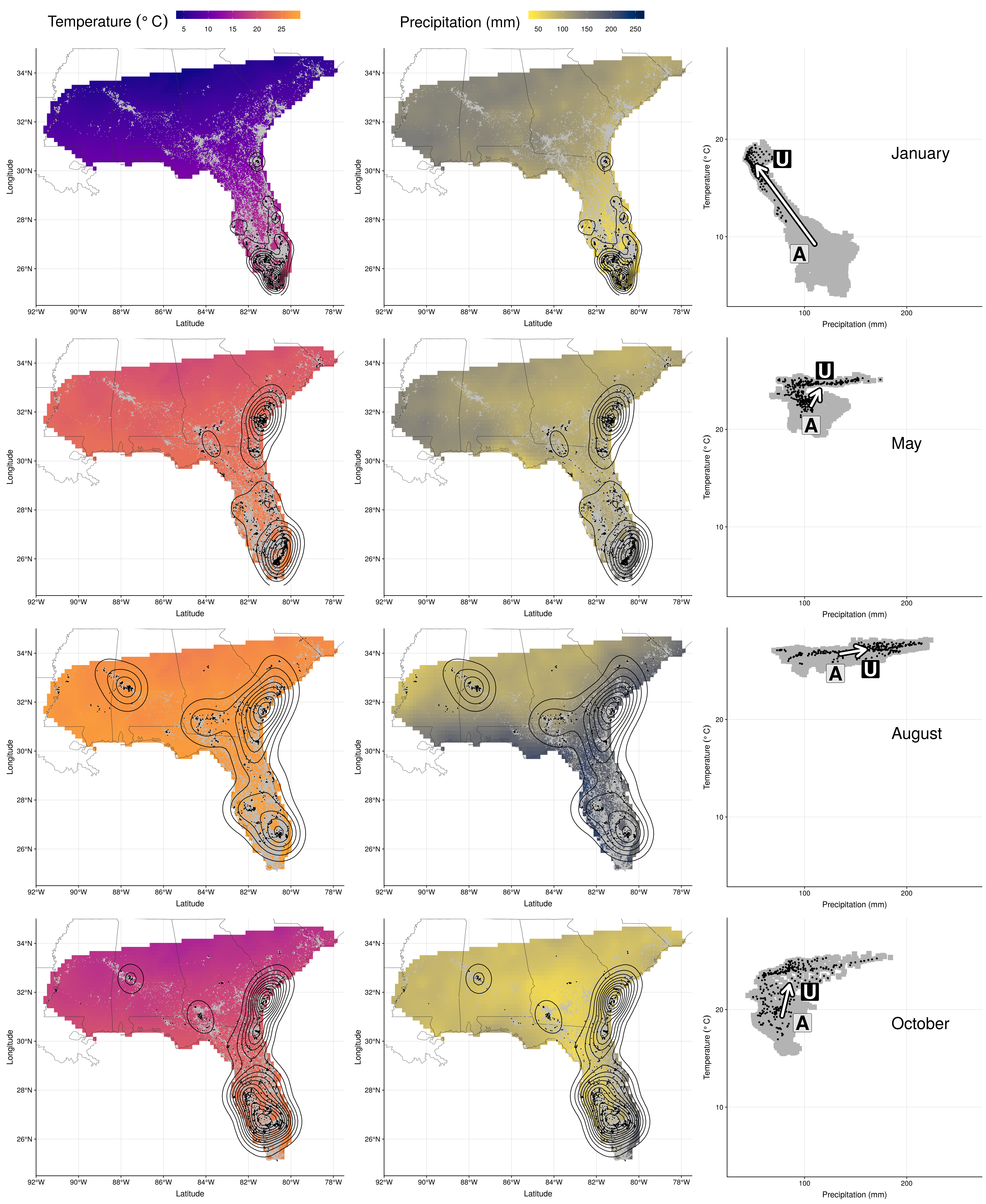
Figure 4.1: Wood stork monthly range (left and center) and climatic niche (right) during January, May, August and October. Range maps show current GPS locations in a given month in black with kernel contour lines, and all locations from the entire dataset shown as a reference in gray, on a background of temperature (left, from blue for colder temperatures to red for warmer temperatures) or precipitations (center, from yellow for dry conditions to blue for wet conditions). Climatic niches show current conditions used in a given month (precipitation on the X-axis, and temperature on the Y-axis) in black, in comparison to conditions available in the study area in a given month in gray. The marginality arrow defines the difference between average available conditions (“A”) and average used conditions (“U”).
4.2 Fig.2: Overlap matrices
par(mar = c(3, 3, 2, 0.1) + 0.4, mfrow = c(1, 2))
image(x = 1:12, y = 1:12, overGeo, asp = 1, col = viridis(100, direction = -1,
    option = "plasma", alpha = 0.8), axes = FALSE, xlab = "", ylab = "", cex.lab = 1.5)
axis(1, at = 1:12, labels = month.abb, tick = FALSE, line = -0.7)
axis(2, at = 1:12, labels = month.abb, tick = FALSE, line = -0.7)
mtext("Month", side = 1, line = 2, cex = 1.5)
mtext("Month", side = 2, line = 1.7, cex = 1.5)
mtext("A) Geographic overlap", side = 3, line = 0.6, cex = 1.5)
lab <- expand.grid(x = 1:12, y = 1:12)
lab$val <- as.vector(round(overGeo * 100, 0))
text(lab$x, lab$y, lab$val, cex = 1 + (lab$val - 50)/100, col = ifelse(lab$val >=
    80, "white", "black"))
polygon(x = c(rep(0:12 + 0.5, each = 2), rep(11:1 + 0.5, each = 2), 0.5), y = c(1,
    rep(0:11 + 0.5, each = 2), rep(12:1 + 0.5, each = 2)), col = grey(0.7),
    border = NA)
abline(h = c(3.5, 10.5), v = c(3.5, 10.5), lwd = 4)
lines(x = c(0, 2, 2) + 0.5, y = c(2, 2, 0) + 0.5, lwd = 4, lty = "11")
lines(x = c(0, 2, 2) + 0.5, y = c(10, 10, 12) + 0.5, lwd = 4, lty = "11")
polygon(x = c(5, 9, 9, 5) + 0.5, y = c(5, 5, 9, 9) + 0.5, lwd = 4, lty = "11")
lines(x = c(10, 10, 12) + 0.5, y = c(12, 10, 10) + 0.5, lwd = 4, lty = "11")
lines(x = c(10, 10, 12) + 0.5, y = c(0, 2, 2) + 0.5, lwd = 4, lty = "11")
image(x = 1:12, y = 1:12, overClim, asp = 1, col = viridis(100, direction = -1,
    option = "plasma", alpha = 0.8), axes = FALSE, xlab = "", ylab = "", cex.lab = 1.5)
axis(1, at = 1:12, labels = month.abb, tick = FALSE, line = -0.7)
axis(2, at = 1:12, labels = month.abb, tick = FALSE, line = -0.7)
mtext("Month", side = 1, line = 2, cex = 1.5)
mtext("Month", side = 2, line = 1.7, cex = 1.5)
mtext("B) Climatic overlap", side = 3, line = 0.6, cex = 1.5)
lab <- expand.grid(x = 1:12, y = 1:12)
lab$val <- as.vector(round(overClim * 100, 0))
text(lab$x, lab$y, lab$val, cex = 1 + (lab$val - 50)/100, col = ifelse(lab$val >=
    90, "white", "black"))
polygon(x = c(rep(0:12 + 0.5, each = 2), rep(11:1 + 0.5, each = 2), 0.5), y = c(1,
    rep(0:11 + 0.5, each = 2), rep(12:1 + 0.5, each = 2)), col = grey(0.7),
    border = NA)
lines(x = c(0, 2, 2) + 0.5, y = c(2, 2, 0) + 0.5, lwd = 4)
lines(x = c(0, 2, 2) + 0.5, y = c(10, 10, 12) + 0.5, lwd = 4)
polygon(x = c(5, 9, 9, 5) + 0.5, y = c(5, 5, 9, 9) + 0.5, lwd = 4)
lines(x = c(10, 10, 12) + 0.5, y = c(12, 10, 10) + 0.5, lwd = 4)
lines(x = c(10, 10, 12) + 0.5, y = c(0, 2, 2) + 0.5, lwd = 4)
abline(h = c(3.5, 10.5), v = c(3.5, 10.5), lwd = 3, lty = "11")
dev.copy2pdf(file = "Figures/overlap-both.pdf", width = 13.25, height = 7)
## png
## 2
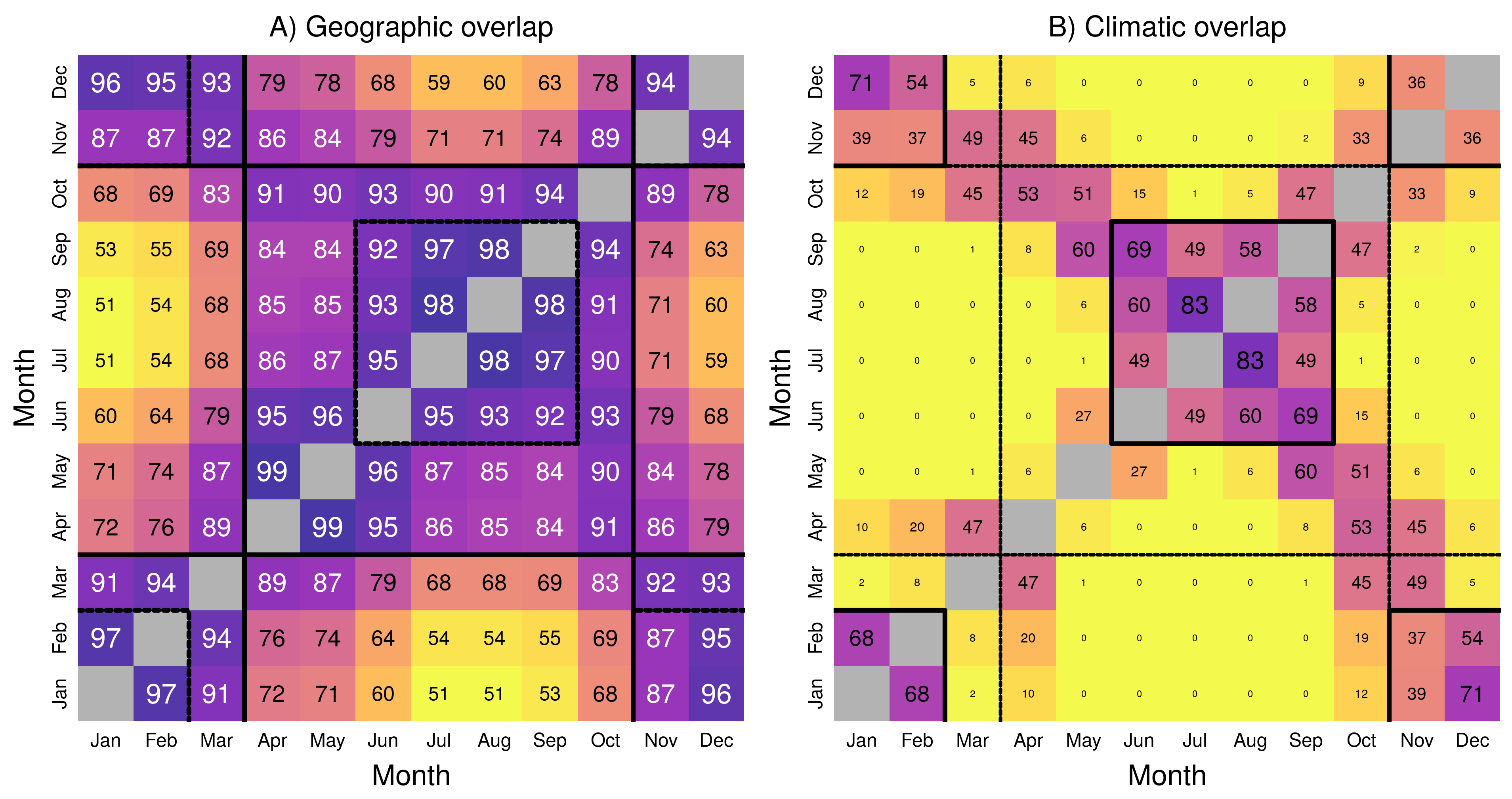
Figure 4.2: Matrices of A) geographic and B) climatic overlap during the year. Each matrix provides Bhattacharyya’s affinity as a percentage (between 0 and 100, higher values corresponding to darker color), as a measure of overlap between two months \(i\) (rows) and \(j\) (columns). The main diagonal, where \(i = j\) is grayed out as all values equal \(1\). Consistent seasons in a given space are highlighted with a bold line, while seasons identified in the other space are highlighted with a dotted line for reference.
4.3 Fig.3: Marginality
ggplot(data = mar, aes(x = prec, y = temp, colour = season, fill = season)) +
    geom_vline(xintercept = 0) + geom_hline(yintercept = 0) +
    geom_segment(aes(x = 0, y = 0, xend = prec, yend = temp),
        arrow = arrow(), lineend = "round", size = 2) +
    geom_label_repel(data = subset(mar, prec < 10), aes(label = abbr),
        size = 6, direction = "x", nudge_y = .3, fontface = "bold",
        colour = "white") +
    geom_label_repel(data = subset(mar, prec > 10), aes(label = abbr),
        size = 6, direction = "both", nudge_x = 3, force = 0.015,
        fontface = "bold", colour = "white") +
    scale_color_viridis(end = .8, direction = -1, option = "plasma") +
    scale_fill_viridis(end = .8, direction = -1, option = "plasma") +
    xlim(-63, 40) + ylim(0, 8.2) +
    labs(x = "Precipitation difference (mm)",
        y = expression("Temperature difference " ( degree~C))) +
    theme(legend.position="none")

cowplot::ggsave("Figures/marginality.pdf")
## Saving 7 x 7 in image
Figure 4.3: Seasonal variation in marginality, as measured by the difference between climatic conditions at wood stork GPS locations vs. the entire study area for each month. Each arrow represents selection in a given month for both precipitation (X-axis) and temperature (Y-axis): Wood storks select drier and warmer areas during the winter (November–April in fuchsia), wetter areas during the summer (June–September in dark blue), and intermediate conditions in transitional seasons (May and October in orange).
4.4 Metadata S1: Animation over the year
library("magick")
img <- image_graph(1785, 603)
niche1
niche2
niche3
niche4
niche5
niche6
niche7
niche8
niche9
niche10
niche11
niche12
dev.off()
animation <- image_animate(img, fps = 1/1.5)
image_write(animation, "Figures/niche-anim.gif")
system("convert Figures/niche-anim.gif Figures/niche-anim.mp4")
system("convert Figures/niche-anim.gif Figures/niche-anim.mov")knitr::include_graphics("Figures/niche-anim.gif")
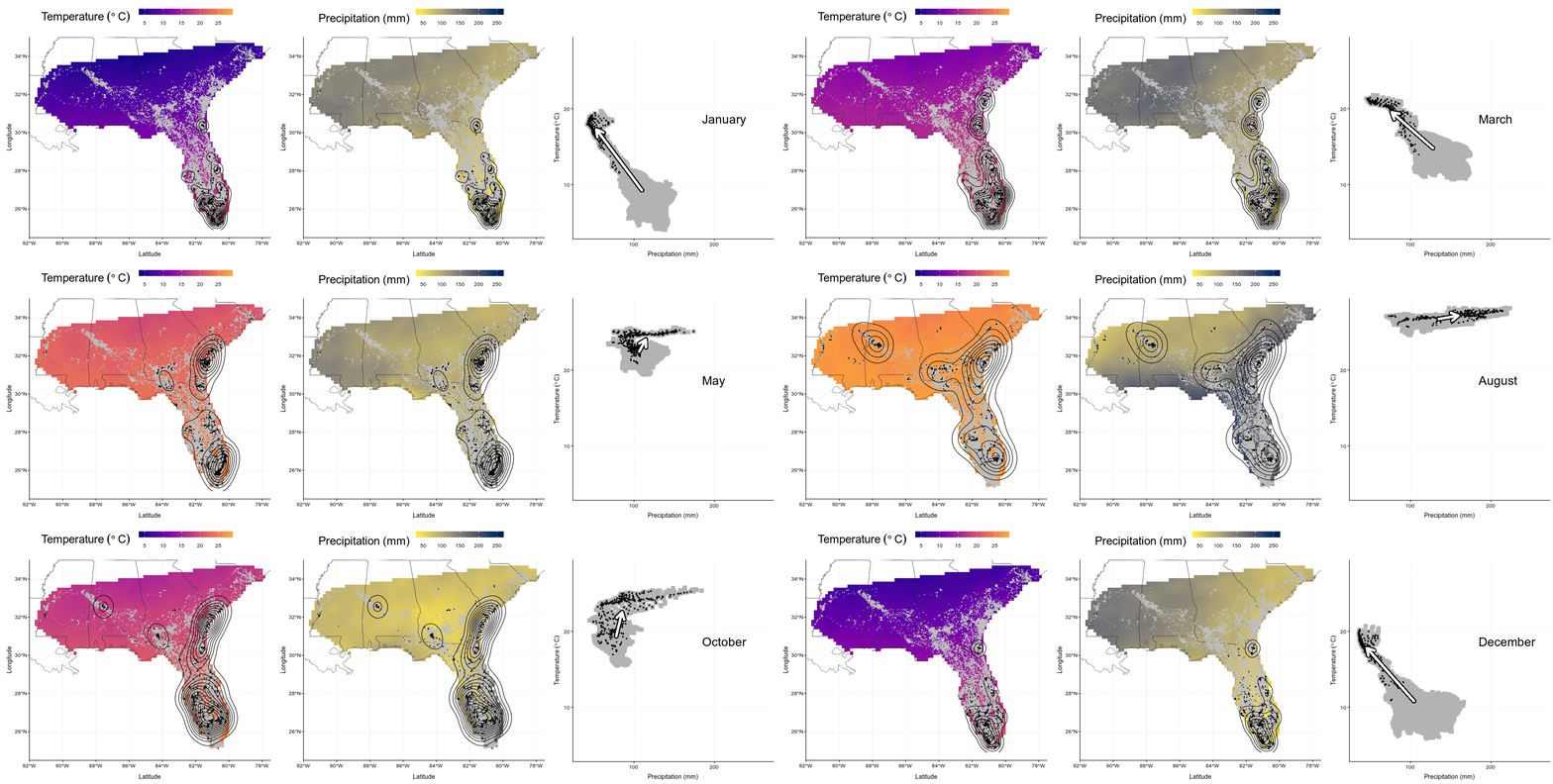
Figure 4.4: In this animation (available as ‘Video_S1.gif’, ‘Video_S1.mp4’, and ‘Video_S1.mov’), each panel presents wood stork monthly ranges (left and center) and climatic niche (right) during the year. Range maps show current GPS locations in a given month in black with kernel contour lines, and all locations from the entire dataset shown as a reference in gray, on a background of temperature (left, from blue for colder temperatures to red for warmer temperatures) or precipitations (center, from yellow for dry conditions to blue for wet conditions). Climatic niches show current conditions used in a given month (precipitation on the X-axis, and temperature on the Y-axis) in black, in comparison to conditions available in the study area in a given month in gray. The marginality arrow defines the difference between average available conditions and average used conditions.